

Events & News
Events & News is a site page I designed for Artists for Humanity's website to let people see their events and news
My Role
UX/UI Designer
User Researcher
Client
Artists for Humanity's Clients
Teammate
Caroline Stenzel
Year
Caroline Stenzel
Overview
Problem
Based on Skateholder's experience with the users, she found out that people rarely look through Artists for Humanity's website for events and news information because they don't know where to look for the events AFH has, nor stay on the website for more than 5 minutes because they are very busy and they love to scroll to look for information. If they could not find the information within a few minutes, they would leave the page.
Background
Artists for Humanity is a non-profit organization, also called AFH. They have events like Open Studio, The Greatest Party On Earth, and articles for people inside and outside of AFH to attend and read about. Before having the "Events&News" page on its website, people knew about AFH's events from AFH employees, attended one before, or lived around the area. So AFH wants more people to check their website and attend their events. Now, people can look through AFH's website to check what events AFH has.
Challenge
How can we redesign Artists for Humanity's website to be more user-friendly and improve user retention rate?
As a designer, I was tasked to design a page inside AFH's website to improve the user retention rate, encouraging users to continue looking through the events, stories, and news AFH has. In addition, I was tasked to design events and news page templates for future events and news and make sure the management team was able to edit the content in Storyblok, a content management system.
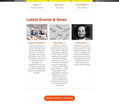
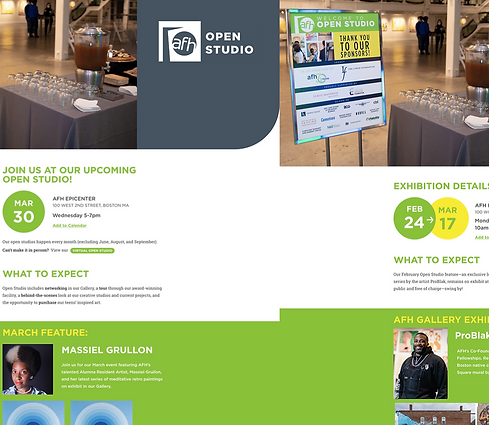
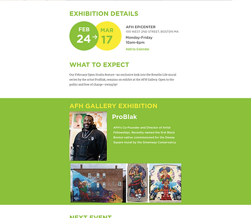
Final Prototype
Final Wireframes
The final design is launched on Artists for Humanity's website. https://www.afhboston.org/events
AFH recently changed its brand color back to orange.


User Research
This survey aims to gain an understanding of users' behaviors and pain points to design intentionally.
Highlights from the survey (11 participants who went to the Open Studio that day)
How did you hear about tonight's Open Studio?
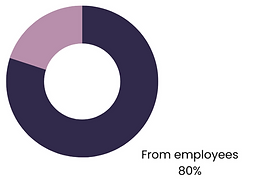
80% of participants know about Open Studio because they know AFH's employees and told them about it
Do you know AFH has other events?

70% of the participants did not know AFH has other events
Have you ever visited AFH's website?

90% of participants visited AFH's website, but they did not use it to learn about tonight's Open Studio
Solutions
Given the insights from the survey, requirements, and feedback from AFH's art director. Here are the solutions my co-worker and I came up with, and these are the hi-fi wireframes:


Benefits for Clients
-
Check events and news easily on the website.
-
Users can plan ahead if they can or can not attend AFH meetings
-
Users can see all events and news with one scroll; no need to click around
-
Have more visuals to help users understand each event
Color Palette
While I work at Artists for Humanity, they are using this color palette for its 30th anniversary. We designed and followed Artists for Humanity's brand guidelines and the art director's requirements when we did the UI and UX for the event page.


Wireframes - drafts


WANT TO SEE MORE? • MORE PROJECTS


